Dashboards
Dashboards are the primary way you view and interact with monitoring data in Stratora. Each dashboard is a grid of panels — charts, gauges, tables, and specialized visualizations — that display real-time and historical metrics for your infrastructure.
Stratora has two kinds of dashboards:
- Auto-generated dashboards — created automatically when you assign a device template to a node. These give you instant visibility with panels tailored to the device type.
- Custom dashboards — built by you using the drag-and-drop dashboard builder. Combine panels from multiple nodes, embed topology maps, world maps, and rack diagrams — whatever view your team needs.
Dashboard Builder
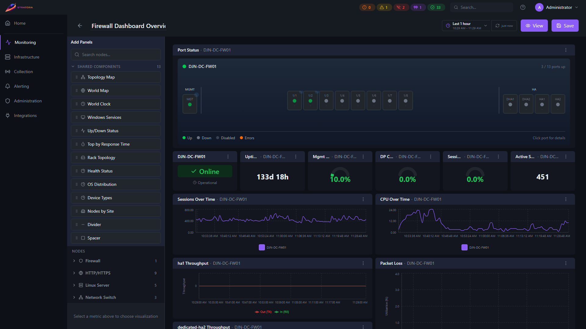
The dashboard builder uses a three-panel layout:
- Left sidebar — browse nodes and available metrics, then drag them onto the canvas
- Center grid — the dashboard canvas where panels are arranged, resized, and repositioned
- Panel settings — configure the selected panel's data source, thresholds, colors, and display options
Edit vs. View Mode
- Edit mode — the full builder interface with drag-and-drop, panel settings, and save controls
- View mode — a clean, read-only display of the dashboard with auto-refreshing data (every 10 seconds by default)
Switch between modes using the Edit / View toggle in the dashboard header.
Drag-and-Drop
To add a panel:
- Open the left sidebar and browse available nodes or metrics
- Drag a metric onto the grid — a preview appears showing where the panel will land
- Drop to place, then resize by dragging the panel's edges
- Click the panel to open its settings and customize the visualization
Panels snap to a grid and automatically compact to prevent gaps.
Panel Types
Stratora ships with a wide range of panel types, each designed for a specific kind of data.
Charts and Graphs
| Panel | Description |
|---|---|
| Line Chart | Time-series visualization with multiple series support — the workhorse for CPU, memory, network, and any metric over time |
| Mirrored Area | Ingress/egress traffic shown symmetrically above and below the axis — ideal for network interface throughput |
| Uptime Timeline | Time-series bar showing up/down periods over the selected range |
Single Values
| Panel | Description |
|---|---|
| Stat | Single numeric value with configurable formatting and threshold-based coloring |
| Gauge | Percentage display with min/max range and warning/critical threshold arcs |
| Status | Health indicator showing the current state of a node (healthy, warning, critical, offline) |
| Up/Down Status | Simple up/down indicator with visual color coding |
Tables and Grids
| Panel | Description |
|---|---|
| Table | Tabular data with sorting, filtering, and configurable columns |
| Port Grid | Interactive switch port visualization with real-time status and PoE indicators — shows all ports in a physical layout |
| Interface Throughput Grid | Per-interface throughput visualization across all interfaces on a device |
| Top by Response Time | Ranked list of nodes by response time — useful for identifying slow devices |
| Incidents Table | Alert and incident history for the scoped nodes |
Infrastructure-Specific
| Panel | Description |
|---|---|
| Windows Services | Windows service status table with history heatmap showing state changes over time |
| Storage Grid | NAS/storage device visualization |
| Disk Bay | Physical drive bay layout with temperature, SMART status, and health per disk |
| SSL Certificate | Certificate details, issuer, and days-until-expiry countdown |
| HTTP Status | HTTP endpoint monitoring with response code and availability |
Embedded Visualizations
| Panel | Description |
|---|---|
| Topology Map | Embeds a saved topology map with live device status overlay |
| World Map | Embeds a saved world map with live pin health |
| Rack | Embeds one or more rack diagrams with live device health |
Layout
| Panel | Description |
|---|---|
| Divider | Visual separator between sections of a dashboard |
| Spacer | Whitespace element for layout control |
Site-Aggregation Panels
These panels aggregate across multiple nodes — typically scoped to a single site — and power the auto-generated site dashboards. They can also be used on custom dashboards.
| Panel | Description |
|---|---|
| Site Health | Aggregated site health score with up/down/warning counts |
| Site Stat | Single-stat tile for a site-level metric (e.g., nodes online, active alerts) |
| Health Breakdown | Donut or bar chart of node health states (healthy / warning / critical / offline) for the scoped site |
| Device Type Breakdown | Distribution of nodes by device category (switches, servers, NAS, etc.) |
| OS Breakdown | Distribution of nodes by operating system family |
| Nodes by Site | Per-site node count rollup — useful on multi-site dashboards |
| WAN Health | WAN circuit availability and latency tile — appears on auto-dashboards when the site has WAN-circuit nodes |
| Top Resources | Aggregate "top N" view across resources (CPU, memory, latency) for the scoped node set |
| Top Disk Utilization | Top N disks by utilization across the scoped node set |
| Rack Topology | Aggregate rack view embedded as a dashboard panel (see Rack Diagrams) |
| Check Config | Built-in synthetic check / config presence panel surfaced on auto-dashboards |
| World Clock | Per-location time tile for multi-region dashboards |
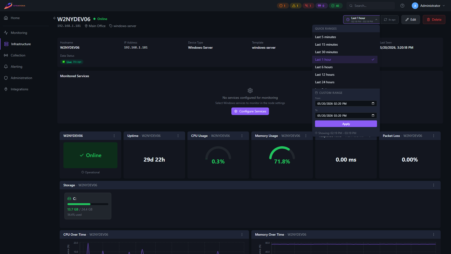
Time Range Controls
Every dashboard has a global time range selector in the header. When you change the time range, all time-series panels on the dashboard update together.
Available presets range from 5 minutes to 7 days. Individual panels can optionally override the global range if needed.
Auto-Generated Dashboards
Node Dashboards
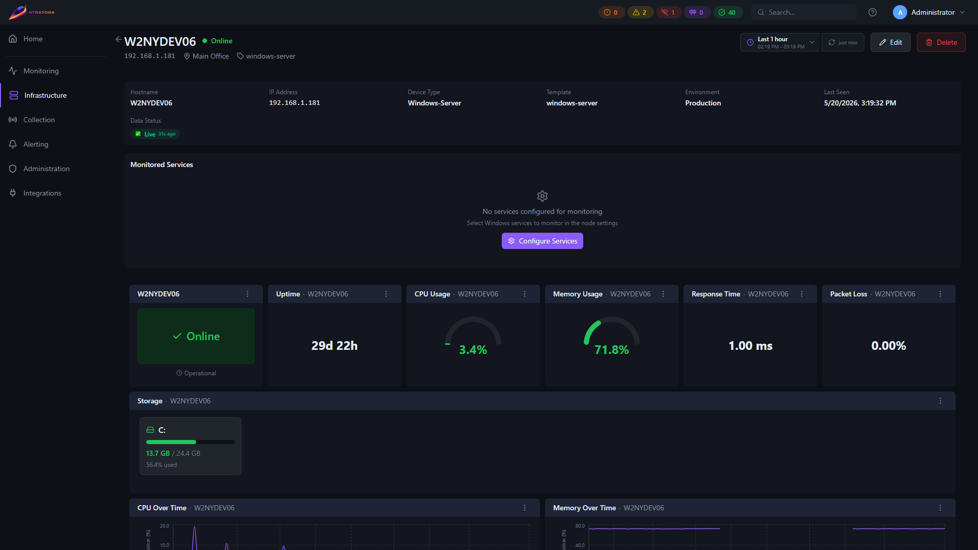
When a node has a device template assigned, Stratora generates a dashboard tailored to that device type. For example:
- A Windows Server node gets CPU/memory gauges, disk usage charts, network throughput, service status, and event log panels
- A Cisco switch gets a port grid, CPU gauges, per-interface traffic charts, and interface error graphs
- A Palo Alto firewall gets management/data-plane CPU, session gauges, throughput charts, and HA status
These dashboards appear automatically on the node's detail view. You don't need to configure anything — the template defines the layout.
You can add a node's auto-generated panels to a custom dashboard. In the builder, select a node from the sidebar and its template-defined panels become available to drag onto your dashboard.
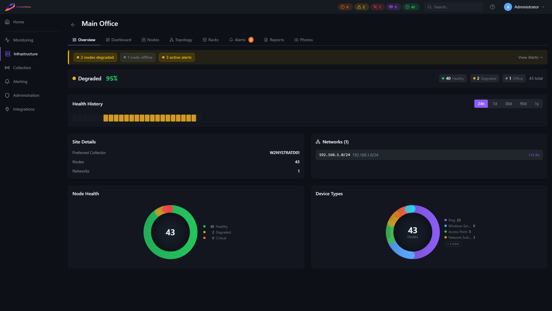
Site Dashboards
When you create a site, Stratora automatically generates a fully-configured monitoring dashboard for it. No manual panel configuration required.
Trigger behavior:
- Dashboard is created on site creation
- Updates automatically when nodes are added, removed, or have their device type changed
- Regeneration is idempotent — safe to trigger multiple times without creating duplicate panels
Default panel layout:
| Row | Panels |
|---|---|
| Key Metrics | Nodes Online, Nodes Down, Active Alerts, Availability, Avg Response Time |
| Topology & Status | Network Topology, Up/Down Status |
| Health & Breakdown | Health Breakdown, Device Types, WAN Health (conditional) |
| Performance | Top by Response Time, Top by CPU, Top by Memory, Top by Disk |
| Alerts | Active Alerts detail |
Conditional panels:
- WAN Health only appears when the site has one or more nodes with
node_type = 'wan_circuit' - Storage Capacity is available in the component picker for custom dashboards but is not included in the auto-generated template
Read-only: Auto-generated site dashboards are read-only and display an "Auto-Generated" badge. Click Clone & Edit to create a customizable copy.
Creating a Custom Dashboard
- Navigate to Monitoring → Dashboards and click New Dashboard
- Give it a name and optional description
- The builder opens in edit mode — drag panels from the sidebar to build your layout
- Click Save when done
Cloning
To duplicate an existing dashboard, open it and select Clone from the actions menu. This creates a copy you can modify independently.
Deleting
Open the dashboard and select Delete from the actions menu. Deleted dashboards cannot be recovered.
Visibility and Sharing
Dashboards have two visibility levels:
| Visibility | Who Can See | Who Can Edit |
|---|---|---|
| Personal | Only the creator | Only the creator |
| Shared | All users | Admins and Operators |
New dashboards default to personal. To share a dashboard, change its visibility from the dashboard settings or actions menu.
Folders
Organize dashboards into folders for easier navigation. Folders support nesting, so you can create a hierarchy that matches your team structure or infrastructure layout.
Favorites
Star dashboards you use frequently. Favorites appear in a dedicated section at the top of the dashboard list for quick access.
Dashboard Scoping
Dashboards can be scoped to different levels of your infrastructure:
- Node-level — panels showing metrics for a single device (the default for auto-generated dashboards)
- Site-level — panels pulling data from multiple nodes at a site, giving you a location-wide view
- Group-level — panels filtered to nodes in a node group, useful for function-based views like "All Production Switches"
- Multi-node — mix panels from any combination of nodes on a single dashboard for cross-cutting views