Understanding the Site Health Report
The Site Health Report provides a comprehensive view of infrastructure reliability over a defined period. It covers uptime, health scores, incident analysis, and trend data across your monitored sites — all formatted as a shareable PDF.
This page explains what each section of the report contains and how to interpret the data.
Executive Summary
The first page of the report presents a high-level overview of infrastructure health across all included sites.
Global Metrics
| Metric | Definition |
|---|---|
| Health Score | The average percentage of non-maintenance nodes in a healthy state across the reporting period, calculated from hourly snapshots |
| Uptime | The percentage of time each site was operational (not fully offline — at least one node was reachable) |
| Healthy Time | The percentage of time all nodes at a site were in a healthy status simultaneously |
| Incidents | The total number of transitions into offline status across all sites (with flap debounce applied) |
The global values are averages across all included sites. Per-site breakdowns appear in later sections.
Uptime and Healthy Time measure different things. A site can have 99.9% uptime (it was almost never fully offline) but only 85% healthy time (individual nodes had issues, though the site as a whole stayed up). Both metrics are important — uptime tracks availability, healthy time tracks full operational health.
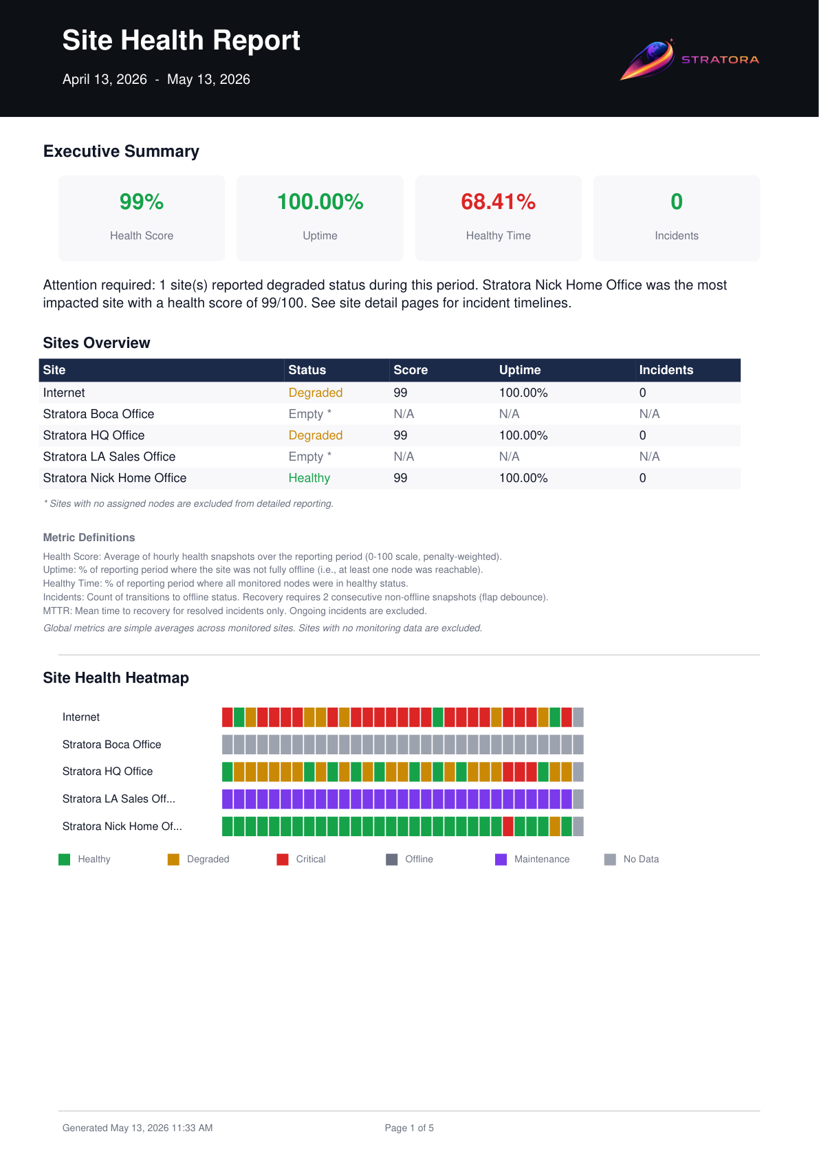
Health Heatmap
The heatmap provides a visual timeline of site status over the reporting period. Each row represents a site, and each column represents a time interval.
Color Coding
| Color | Status |
|---|---|
| Green | Healthy — all nodes operational |
| Yellow | Degraded — one or more nodes have warning-level alerts |
| Orange | Critical — one or more nodes have critical alerts |
| Red | Offline — site is fully unreachable |
| Gray | Maintenance — site is in a maintenance window |
| White | No data — site had no monitored nodes during this interval |
The heatmap makes it easy to spot patterns — recurring degradation at specific times, prolonged outages, or the impact of maintenance windows.
Uptime & Healthy Time
This section provides a per-site breakdown of availability metrics in a tabular format.
For each site, the report shows:
| Column | Description |
|---|---|
| Site | Site name |
| Uptime % | Percentage of time the site was not fully offline |
| Healthy Time % | Percentage of time all nodes were healthy |
| Downtime | Total duration the site was fully offline |
| Degraded Time | Total duration one or more nodes were in a non-healthy state |
Sites are sorted by uptime percentage (lowest first) so problem areas are immediately visible.
Incident Analysis
The incident analysis section summarizes offline events across the reporting period.
For each site:
| Column | Description |
|---|---|
| Site | Site name |
| Incidents | Number of offline transitions (after flap debounce) |
| Total Downtime | Cumulative offline duration |
| MTTR | Mean time to recover — average duration from incident start to resolution |
| Longest Incident | Duration of the single longest offline event |
A high incident count with low MTTR may indicate brief, recurring issues (e.g., flaky connectivity). A low incident count with high MTTR points to fewer but more serious outages. Both patterns warrant different investigation approaches.
Flap Debounce
To avoid inflating incident counts, Stratora applies a 2-hour debounce window. If a site transitions from offline back to online and then offline again within 2 hours, it is counted as a single incident rather than multiple separate events.
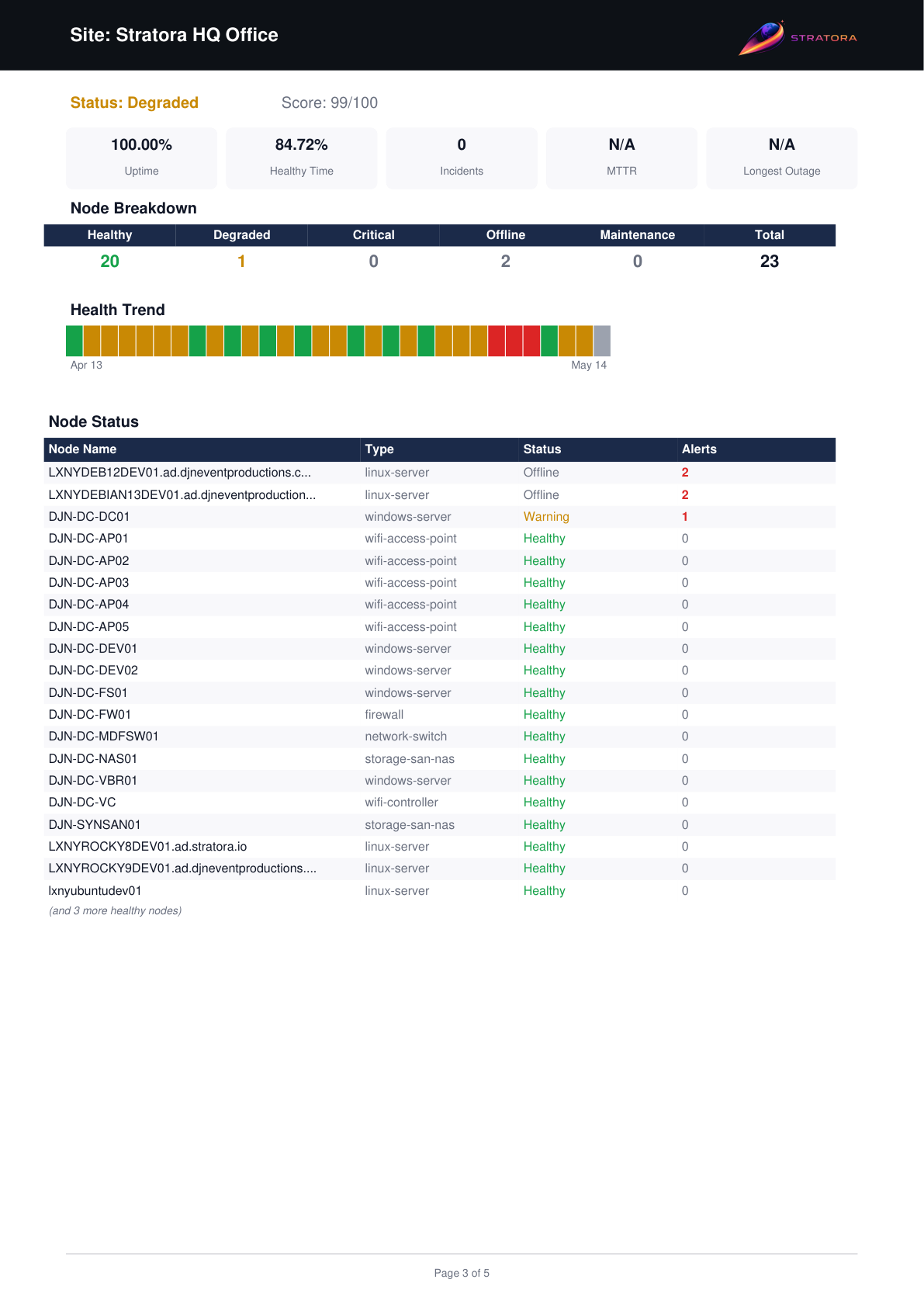
Node Breakdown
The node breakdown section dives into per-node detail within each site. This is the most granular section of the report.
For each node:
| Column | Description |
|---|---|
| Node | Node name |
| Health Score | Time-averaged health percentage for the node |
| Uptime % | Percentage of time the node was reachable |
| Incidents | Offline transitions for this specific node |
| Status Distribution | Percentage of time spent in each status (healthy, warning, critical, offline, maintenance) |
This section is especially useful for identifying specific devices that are dragging down a site's overall health score.
Trend Analysis
The trend analysis section plots health scores over time, showing whether sites are improving, stable, or declining.
Each site's health score is charted across the reporting period in weekly intervals (or daily intervals for 7-day reports). The report highlights:
- Improving sites — health score trending upward
- Declining sites — health score trending downward
- Stable sites — health score consistent throughout the period
This section helps you answer the question: "Are things getting better or worse?"
Cross-Site Comparison
The final section ranks all included sites by reliability, giving you a quick view of your best and worst-performing locations.
| Column | Description |
|---|---|
| Rank | Position based on composite reliability score |
| Site | Site name |
| Health Score | Average health percentage |
| Uptime | Uptime percentage |
| Incidents | Total offline incidents |
| MTTR | Mean time to recover |
Use the cross-site comparison in client-facing reports to highlight strong-performing sites while identifying locations that need attention. The ranked format makes it easy for non-technical stakeholders to understand relative performance.